Showing posts with label Visual Analytics. Show all posts

Tuesday, May 6, 2014

Excel Modeling: Voronoi Diagram in Excel

Voronoi is a mathematical tool that helps us show easily influential areas of a company o institutions. In business it is a powerful tool to see what is your potential market graphically, and create population clusters based on locations.

As an example of clusters, I divided the Peruvian country by departments using a voronoi diagram. Each area represents the minimum distance to its capital, assuming no natural barriers. If you see Loreto, almost half of it is closer to San Martin and Ucayali. There are many useful policy decisions that regional policymakers can make using this analysis.


Peru: Voronoi Diagram

Many chain retailers are using this analysis to have a grasp of the competitors and their potential markets before opening a new store.
Usually to do this analysis you have to use advanced software like R, Matlab or ArcGis among others.

Using only Excel formulas, I was able to replicate the calculations of influential areas for a popular supermarket in Peru and what would be its "market share" if there were not competition.

To build this model I needed only the geolocation of the supermarket, and the border limits to do the analysis.

The general idea that I used to build the Excel function (no VBA) was:

m, n number of pixels to draw
x1,x2,...xk: Latitude
y1,y2,...yk: Longitude

for i = 1 : m
y = ( m - i ) / ( m - 1 ) ;
   for j = 1 : n
   x = ( j - 1 ) / ( n - 1 ) ;
      for kk = 1 : k
      d = min(norm ([x1,y2] - [ x , y ] ));
      end
      a(i,j)=closest k store
   end
end

The Excel formulas that I used were a combination of arrays, Index, Match, and Min.

Plaza Vea: Voronoi Diagram
The  Excel file is here
If you found this helpful, please share.

Friday, August 23, 2013

Financial Modeling: Excel Forecasting Trends


I created an Excel model to try different line trends and choose which of them is going to be the best fit for the model.

Many time series contain trends. A trend usually measure the time persistence of one variable (sales, price, etc) which is difficult to foresee that it will remain in the future.

A good practice to identify a trend is to insert a line graph, and try different trend options in Excel.
Among these options, the most common types are:

Function Expression Excel formula
Linear y = bx+a =LINEST(y,x's)
Logarithmic y = bLn(x) + a =LINEST(y, LN(x's))
Power y = ax^b =LINEST(LN(y), LN(x's))
Exponential base e y = ae^(bx) =LINEST(LN(y), x)
Polynomial Order 2 y = cx^2+bx+a =LINEST(y,{x^2,x})
Polynomial Order 3 y = dx^3+cx^2+bx+a =LINEST(y,{x^3,x^2,x})

Once we have identify the best fit for our data. We need to rebuild the trend based on the function type and its mathematical expression.

Why do we care to choose the right trend?

Trend sometimes has a huge impact in the variable behavior, and choosing the wrong one we can introduce errors in our model.

What is the advantage of using my Excel file attached?

There are two. First it gives us automatically the best R2 among all the trend options, and, second, check the future behavior that we are going to introduce in our model.


Here is the Excel file (link). If you found this helpful, please share.

Saturday, August 3, 2013

Excel Contour Graph: Unemployment Rate by States


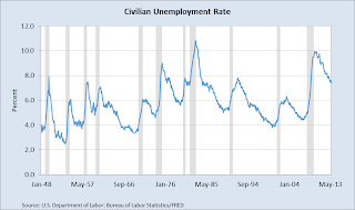
Have you ever had to include the same graph over and over? It is something very common when you have to report. In order to continue giving more insights with the same information it is necessary to look for creative ways to show your work.  A good starting point is to add other dimensions to your graph; these dimensions could be time, levels, geography etc.

One of the most simple two-dimensional graph is the line chart. It gives us trends and one value to focus. If you want to show something new with the same information, and not overload your audiencia you can add other dimensions using other type of graphs.


One good alternative is to use contour graph in Excel. The beauty of this graph is that we get the advantage of a 3-D graph in a 2-D. In this example, we can see in colors how the unemployment rate evolves by state, but also we get a big picture of what is happening in all the country.

Advantages: It is very easy to format, and we can add more levels of colors.
Disadvantages: Difficult to track specific values, in this case it is not possible to differentiate specific ranges by state. An alternative solution is to use horizontal charts.
If you found this helpful, please share.
Here is the link with the Excel.

Thursday, July 25, 2013

Excel Geoflow Data Visualization


Geoflow for Excel 2013 allows us to visualize geographic and temporal data in Excel. It is very simple to use. I created an Excel example with the database of Wal-Mart; I only needed to define the latitude and longitude of each point, and defined what chart to show. Here is a video demo of how easy is to work with Geoflow.


The link of the Excel file is here.
Here is other link how to install Geoflow.If you found this helpful, please share.
Friday, July 19, 2013

Excel Power View: World Economic Outlook

Power View is a powerful add-in that allows us to visualize  the information included in PowerPivot. It includes a canvas page where we can create maps, add charts, upload images and setup tiles.  It has some characteristics similar to Tableau. In this posting I included an small example where I mapped the countries with the highest GDP growth in 2013 and added their respective flags, name and values. It is possible to choose other variables, and years. The world map was created automatically from Bing maps, and the flag images were uploaded from different URL addresses. This new concept of dynamic dashboards will definitively help Excel to compete with other database visualization software


The link of the Excel file is here
If you found this helpful, please share.

Tuesday, February 12, 2013

Excel Add-in: XY Chart Labeler


It is one of the most useful add-ins in excel; it helps you to add labels to XY chart data points (scatter plot). Without this add-in we have to do it manually, which sometimes it is impossible. In the future, Excel should include this functionality but for the moment a good alternative option is to use this add-in. Find the link of the add-in below and an example.

If you found this helpful, please share.

Excel Example Scatter Plot
XY Chart Labeler

Saturday, February 9, 2013

TreeMap: World Economy 2012

The excel add-in is a powerful tool that helps us to create more complex analysis in excel. There are many of them that we can get free in internet. One of the best that I found is Sparklines (link below). As an Example, I created a treemap using this add-in which shows how the participation in the world economy is changing between 2012 and 2000. China's and India's contributions are significantly better while the developed countries are falling behind. 

If you found this helpful, please share.

Download links:
Sparklines Excel
How to install an add-in
Download Excel file here

Thursday, February 7, 2013

Excel Maps: Unemployment Rate 2012 by States

Excel allows you to include and edit maps easily. Here is a map of United States by states including unemployment rate in 2012. You can download the excel file and edit this map using conditional formatting (thank you Wayne Winston for the classes). I did not know that Indiana has an unemployment rate higher than 8%.


Wednesday, February 6, 2013

Excel Maps: World Economic Indicators

Excel is like our brain, we have only exploit less than 10% of its capabilities. Using an small VBA program and shape maps we can generate beautiful maps and at our convenience change their colors using the power of conditional formatting. In this example I mapped the 2012 Public Debt in GDP percentage. For example, the red color indicates the countries that are highly indebted. In the link below you can find the excel file that help me create this map. Enjoy!    


 https://www.dropbox.com/s/lwlkqcngh61lill/Indicators%20World%20Map.xlsm

If you found this helpful, please share.