Making sense of data using business analytics to make sound financial decisions
Saturday, August 3, 2013
Excel Contour Graph: Unemployment Rate by States
Have you ever had to include the same graph over and over? It is something very common when you have to report. In order to continue giving more insights with the same information it is necessary to look for creative ways to show your work. A good starting point is to add other dimensions to your graph; these dimensions could be time, levels, geography etc.
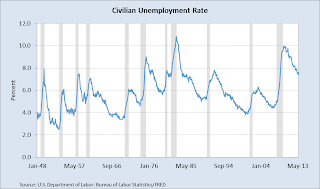
One of the most simple two-dimensional graph is the line chart. It gives us trends and one value to focus. If you want to show something new with the same information, and not overload your audiencia you can add other dimensions using other type of graphs.
One good alternative is to use contour graph in Excel. The beauty of this graph is that we get the advantage of a 3-D graph in a 2-D. In this example, we can see in colors how the unemployment rate evolves by state, but also we get a big picture of what is happening in all the country.
Advantages: It is very easy to format, and we can add more levels of colors.
Disadvantages: Difficult to track specific values, in this case it is not possible to differentiate specific ranges by state. An alternative solution is to use horizontal charts.
If you found this helpful, please share.
Here is the link with the Excel.
Subscribe to:
Post Comments (Atom)


No comments:
Post a Comment