Friday, August 23, 2013

Financial Modeling: Excel Forecasting Trends


I created an Excel model to try different line trends and choose which of them is going to be the best fit for the model.

Many time series contain trends. A trend usually measure the time persistence of one variable (sales, price, etc) which is difficult to foresee that it will remain in the future.

A good practice to identify a trend is to insert a line graph, and try different trend options in Excel.
Among these options, the most common types are:

Function Expression Excel formula
Linear y = bx+a =LINEST(y,x's)
Logarithmic y = bLn(x) + a =LINEST(y, LN(x's))
Power y = ax^b =LINEST(LN(y), LN(x's))
Exponential base e y = ae^(bx) =LINEST(LN(y), x)
Polynomial Order 2 y = cx^2+bx+a =LINEST(y,{x^2,x})
Polynomial Order 3 y = dx^3+cx^2+bx+a =LINEST(y,{x^3,x^2,x})

Once we have identify the best fit for our data. We need to rebuild the trend based on the function type and its mathematical expression.

Why do we care to choose the right trend?

Trend sometimes has a huge impact in the variable behavior, and choosing the wrong one we can introduce errors in our model.

What is the advantage of using my Excel file attached?

There are two. First it gives us automatically the best R2 among all the trend options, and, second, check the future behavior that we are going to introduce in our model.


Here is the Excel file (link). If you found this helpful, please share.

Thursday, August 22, 2013

Financial Modeling: Sensitivity Analysis in Excel


Following the analysis of the last posting, we know how to do a Regression Tornado.  Now doing a little math, we can change the standardized coefficients to dollar values and identify the monetary impact. For example, a standard deviation  increase in Unit Sales Y1 impacts the NPV by $ 6 million, and one sigma Growth Rate changes the NPV by one million.


Case study: We need to increase the NPV by $5 million. What do we need to do?

To achieve this goal we need to raise 21 million units in the Units Sales Y1 which is feasible given the 30 million units gap between the baseline and the best scenario in our model. On the other hand, to achieve the same goal using Growth Rate we need to boost growth sales by 3.5%. 

Here is the link with the Excel file. If you found this helpful, please share.

Friday, August 9, 2013

Financial Modeling: Regression Tornado Graph Without @Risk


Regression tornado graph below is a useful tool that shows the most important variables impacting a model. Now, this tool is only found in @Risk, but using standard Excel functions I replicated this analysis in this Blog.

What is the difference between a normal regression and a regression tornado? The coefficients of the regression tornado are standardized or adjusted to make them comparable and to easily extract conclusions from them. The standarized coefficients give us how many standard deviations the main output is going to change when the independent variable change by one standard deviation.

For example, in this model: NPV=f(Sales, Growt Rate, ...)

At first glance, Unit Sales Y1 has more impact on the NPV than the Growth Rate. A standard deviation  (sigma) increase in Unit Sales Y1 results in an increase of 0.8 standard deviation in the NPV, while one sigma increase in growth rate is only 0.2 increase in NPV.

Why is it important? It tells us that we need to start very strong in our first year sales because it will make a huge difference in the NPV outcome.

All my calculations are in this Excel file (link).
Here is a useful manual of how to use tornado regression charts in @Risk (link).
If you found this helpful, please share.

Wednesday, August 7, 2013

Financial Modeling: Using Triangular Distribution


In financial modeling one of  more used functions in business decision-making is the triangular distribution. This function is very practical because it includes business knowledge of the experts. It only needs three elements from them: their worst, most likely, and best scenario. 

The challenge: I was able to solve a financial model with uncertainties without using @Risk and VBA. My project has two uncertainties: Sales and growth. 
  • The first year of sales: Min=80, Max=200, Mode= 170 million units
  • Growth rate from 2Y-5Y: Min=3%, Max=8%, Mode=5%
Additional information: Investment=$50 million, Infl.=2%, p=$0.20, c=$0.08

Based on this information I built the model to get the NPV. I used the triangular function to include managers’ perception about sales and growth. To complete the simulation I created a data table to iterate 1000 times the NPV outcomes.


The main results:

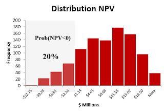
  • Mean NPV=+$6.6 million with a 95% of chance that this mean will be between $6.1 and $7.0 million.
  • 20% of probability of losses (NPV<0).


Some useful tricks: 
  • Excel does not include a triangular function, so it is necessary to install a free add-in that can be found here. This add-in also includes a large number of optimized probability functions. I hope the next Excel version will include a triangular function in its library. 
  • New function: NtRandTriangular(X,Min,Max,Mode). It is a random generator for a triangular distribution. X is the number of interactions that we want to simulate (1000). It creates internally a vector with the size of X. 
  • Excel function: Index(vector,n). This function allows me to extract the specific interaction from the vector NtRandTriangular.
  • In the data table the NPV is the final outcome. In order to get new NPVs for each row I linked to the interaction number; this will update and save the new NPV.
Here is the Excel file with the project (link).
If you found this helpful, please share.

Saturday, August 3, 2013

Excel Contour Graph: Unemployment Rate by States


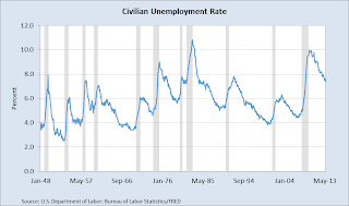
Have you ever had to include the same graph over and over? It is something very common when you have to report. In order to continue giving more insights with the same information it is necessary to look for creative ways to show your work.  A good starting point is to add other dimensions to your graph; these dimensions could be time, levels, geography etc.

One of the most simple two-dimensional graph is the line chart. It gives us trends and one value to focus. If you want to show something new with the same information, and not overload your audiencia you can add other dimensions using other type of graphs.


One good alternative is to use contour graph in Excel. The beauty of this graph is that we get the advantage of a 3-D graph in a 2-D. In this example, we can see in colors how the unemployment rate evolves by state, but also we get a big picture of what is happening in all the country.

Advantages: It is very easy to format, and we can add more levels of colors.
Disadvantages: Difficult to track specific values, in this case it is not possible to differentiate specific ranges by state. An alternative solution is to use horizontal charts.
If you found this helpful, please share.
Here is the link with the Excel.