Wednesday, November 20, 2013

Excel Modeling: Optimal Taxi Model

Imagine that you manage a taxi company and want to select the taxi that helps to minimize the time to get to the new client. This tool helps to make decisions quickly and increase profits for the company having the clients happy.


In this example I randomly put ten taxis in a squared area moving to a new destination. I randomly put a client in this place and get the best taxi to optimally serve the client based in the least distance. 

In real life the implementation should not be a problem. A GPS in every taxi unit and the client location (latitude and longitude) are the necessary tools to be able to use the model. 

Here is the link.

If you found this helpful, please share.

Friday, August 23, 2013

Financial Modeling: Excel Forecasting Trends


I created an Excel model to try different line trends and choose which of them is going to be the best fit for the model.

Many time series contain trends. A trend usually measure the time persistence of one variable (sales, price, etc) which is difficult to foresee that it will remain in the future.

A good practice to identify a trend is to insert a line graph, and try different trend options in Excel.
Among these options, the most common types are:

Function Expression Excel formula
Linear y = bx+a =LINEST(y,x's)
Logarithmic y = bLn(x) + a =LINEST(y, LN(x's))
Power y = ax^b =LINEST(LN(y), LN(x's))
Exponential base e y = ae^(bx) =LINEST(LN(y), x)
Polynomial Order 2 y = cx^2+bx+a =LINEST(y,{x^2,x})
Polynomial Order 3 y = dx^3+cx^2+bx+a =LINEST(y,{x^3,x^2,x})

Once we have identify the best fit for our data. We need to rebuild the trend based on the function type and its mathematical expression.

Why do we care to choose the right trend?

Trend sometimes has a huge impact in the variable behavior, and choosing the wrong one we can introduce errors in our model.

What is the advantage of using my Excel file attached?

There are two. First it gives us automatically the best R2 among all the trend options, and, second, check the future behavior that we are going to introduce in our model.


Here is the Excel file (link). If you found this helpful, please share.

Thursday, August 22, 2013

Financial Modeling: Sensitivity Analysis in Excel


Following the analysis of the last posting, we know how to do a Regression Tornado.  Now doing a little math, we can change the standardized coefficients to dollar values and identify the monetary impact. For example, a standard deviation  increase in Unit Sales Y1 impacts the NPV by $ 6 million, and one sigma Growth Rate changes the NPV by one million.


Case study: We need to increase the NPV by $5 million. What do we need to do?

To achieve this goal we need to raise 21 million units in the Units Sales Y1 which is feasible given the 30 million units gap between the baseline and the best scenario in our model. On the other hand, to achieve the same goal using Growth Rate we need to boost growth sales by 3.5%. 

Here is the link with the Excel file. If you found this helpful, please share.

Friday, August 9, 2013

Financial Modeling: Regression Tornado Graph Without @Risk


Regression tornado graph below is a useful tool that shows the most important variables impacting a model. Now, this tool is only found in @Risk, but using standard Excel functions I replicated this analysis in this Blog.

What is the difference between a normal regression and a regression tornado? The coefficients of the regression tornado are standardized or adjusted to make them comparable and to easily extract conclusions from them. The standarized coefficients give us how many standard deviations the main output is going to change when the independent variable change by one standard deviation.

For example, in this model: NPV=f(Sales, Growt Rate, ...)

At first glance, Unit Sales Y1 has more impact on the NPV than the Growth Rate. A standard deviation  (sigma) increase in Unit Sales Y1 results in an increase of 0.8 standard deviation in the NPV, while one sigma increase in growth rate is only 0.2 increase in NPV.

Why is it important? It tells us that we need to start very strong in our first year sales because it will make a huge difference in the NPV outcome.

All my calculations are in this Excel file (link).
Here is a useful manual of how to use tornado regression charts in @Risk (link).
If you found this helpful, please share.

Wednesday, August 7, 2013

Financial Modeling: Using Triangular Distribution


In financial modeling one of  more used functions in business decision-making is the triangular distribution. This function is very practical because it includes business knowledge of the experts. It only needs three elements from them: their worst, most likely, and best scenario. 

The challenge: I was able to solve a financial model with uncertainties without using @Risk and VBA. My project has two uncertainties: Sales and growth. 
  • The first year of sales: Min=80, Max=200, Mode= 170 million units
  • Growth rate from 2Y-5Y: Min=3%, Max=8%, Mode=5%
Additional information: Investment=$50 million, Infl.=2%, p=$0.20, c=$0.08

Based on this information I built the model to get the NPV. I used the triangular function to include managers’ perception about sales and growth. To complete the simulation I created a data table to iterate 1000 times the NPV outcomes.


The main results:

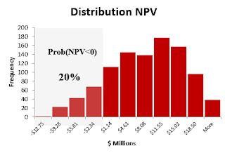
  • Mean NPV=+$6.6 million with a 95% of chance that this mean will be between $6.1 and $7.0 million.
  • 20% of probability of losses (NPV<0).


Some useful tricks: 
  • Excel does not include a triangular function, so it is necessary to install a free add-in that can be found here. This add-in also includes a large number of optimized probability functions. I hope the next Excel version will include a triangular function in its library. 
  • New function: NtRandTriangular(X,Min,Max,Mode). It is a random generator for a triangular distribution. X is the number of interactions that we want to simulate (1000). It creates internally a vector with the size of X. 
  • Excel function: Index(vector,n). This function allows me to extract the specific interaction from the vector NtRandTriangular.
  • In the data table the NPV is the final outcome. In order to get new NPVs for each row I linked to the interaction number; this will update and save the new NPV.
Here is the Excel file with the project (link).
If you found this helpful, please share.

Saturday, August 3, 2013

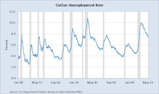
Excel Contour Graph: Unemployment Rate by States


Have you ever had to include the same graph over and over? It is something very common when you have to report. In order to continue giving more insights with the same information it is necessary to look for creative ways to show your work.  A good starting point is to add other dimensions to your graph; these dimensions could be time, levels, geography etc.

One of the most simple two-dimensional graph is the line chart. It gives us trends and one value to focus. If you want to show something new with the same information, and not overload your audiencia you can add other dimensions using other type of graphs.


One good alternative is to use contour graph in Excel. The beauty of this graph is that we get the advantage of a 3-D graph in a 2-D. In this example, we can see in colors how the unemployment rate evolves by state, but also we get a big picture of what is happening in all the country.

Advantages: It is very easy to format, and we can add more levels of colors.
Disadvantages: Difficult to track specific values, in this case it is not possible to differentiate specific ranges by state. An alternative solution is to use horizontal charts.
If you found this helpful, please share.
Here is the link with the Excel.

Thursday, July 25, 2013

Excel Geoflow Data Visualization


Geoflow for Excel 2013 allows us to visualize geographic and temporal data in Excel. It is very simple to use. I created an Excel example with the database of Wal-Mart; I only needed to define the latitude and longitude of each point, and defined what chart to show. Here is a video demo of how easy is to work with Geoflow.


The link of the Excel file is here.
Here is other link how to install Geoflow.If you found this helpful, please share.
Friday, July 19, 2013

Excel Power View: World Economic Outlook

Power View is a powerful add-in that allows us to visualize  the information included in PowerPivot. It includes a canvas page where we can create maps, add charts, upload images and setup tiles.  It has some characteristics similar to Tableau. In this posting I included an small example where I mapped the countries with the highest GDP growth in 2013 and added their respective flags, name and values. It is possible to choose other variables, and years. The world map was created automatically from Bing maps, and the flag images were uploaded from different URL addresses. This new concept of dynamic dashboards will definitively help Excel to compete with other database visualization software


The link of the Excel file is here
If you found this helpful, please share.

Thursday, July 18, 2013

Excel PowerPivot: World Economic Indicators

PowerPivot allows us to organize our information efficiently. We can import databases directly to PowerPivot and create relationships to better handle the information. These relationships help us to structure better pivot tables. For example, I linked three tables which contain data values, list of economic indicators, and country names from the IMF. I created a pivot table from these three different tables and used Excel sliders to extract the relevant variables that we want study. 


Excel file can be found here. Enjoy!

Excel Solver: Optimal Budget

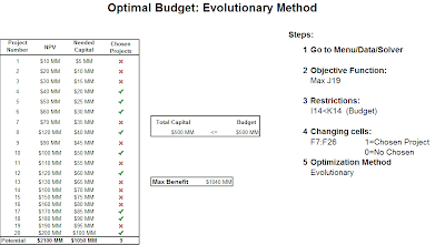
You are in a budget dilemma and do not know what projects to choose. Well, let Excel Solver help you with this task. You only need to active the solver option in Excel and arrange the information follow this pattern:

1. What is your goal? 
2. What are your constraints? 
3. What are your variables to change? 
4. What optimization method is best? 

In this example, I used the sum of NPV as a variable to maximize.
My main constraint was a budget restriction of $500MM. The changing cells are binary numbers (0,1) that solver had to chose to maximize NPV total. The optimization method was evolutionary.


If you found this helpful, please share.

Many other examples can be found in this book
You can donwload the Excel file hereEnjoy!

Sunday, March 10, 2013

Excel Function: Looking for Alphas

Alpha measures the excess of returns in investments against some benchmark. For Example, it means if an investor is expected to earn X% in Apple, she probably would get 2% extra. This abnormal returns are usually measured using a similar CAPM approach. One way to do it is running a linear regression between the asset return and the market return (SP&500) both adjusted by a fixed return (Treasury Bill). I used 60 months (5 years) of historical data to do the estimation. I calculated the Alphas for the first 20 companies with the biggest market capitalization. In my calculations only Philip Morris International (consumer staples industry) showed an Alpha statistically significant at the 5% level. Its Alpha return was around 1.2% (14% annually). In the same direction, Apple showed the highest Alpha in the sample of around 2% (24% annually), but the alpha coefficient was not statistically significant at the 5% level.

Technical details: I used the Stock Market Functions add-in to get automatically the data for the end of the month (link). The Excel functions that I used were:
  • Linest(Range Y,Range X,TRUE, TRUE): Get the main statistics of a regression in array format
  • Index(Array, Row, Column): Extract from an array format (Linest) specific indicators. In particular, I used to get the std error from Beta and Alpha
  • Slope(Range Y,Range X): Get directly the slope coefficient from a regression
  • Intercept(Range Y,Range X): Get directly the intercept from a regression
The excel file with the calculations is here. If you found this helpful, please share.

Alpha Calculations 
(Monthly returns)

Thursday, March 7, 2013

Excel Data Table: Optimal Moving Average

Do you believe that the technical analysis in the stock market works? If your answer is yes, you can try to use excel to help you make an informed decision and choose the optimal parameters. I chose the moving average (MA) as an example of technical analysis, the MA and its different combinations have been used for a long time in the stock market to support investments. Now with Excel you can download time series of any stock automatically and start building your own analysis. I calculated the optimal MA for all stocks in the SP&500 using data tables. Excel is very flexible when you want to implement new methods and ideas. Enjoy!  

Optimal Moving Average

Technical details: Install the Stock Market Functions add-in (link) and use data tables. The link to my excel file is here.If you found this helpful, please share.

Sunday, March 3, 2013

Excel: GDP Portfolio Optimization

Where would you want to invest your money if the GDP were your only indicator to make your decision? I built a portfolio model using GDP of countries and the Markowitz' Modern Portfolio theory. The results that I got were expected. For a portfolio return of 4% in the efficient frontier, India and China have to have a basket participation of 24% together. It is not a big surprise. Some developed countries also show important participation. If the investor wants higher returns (7%) and higher risk, the portfolio participation of China and India have to increase to 62%.  

Technical details: I applied what I learnt in Spreadsheet Modelling for Finance. For the GDP information, I got the information from the WEO database (link). I calculated the efficient frontier using solver tables (link) and for the computation of big matrices I installed this add-in (link). The link to get my excel file of the calculation is below. Enjoy!


Portfolio Return of 4%


Saturday, March 2, 2013

Excel VBA: Google Map Analytics

Determine the optimal location is an important factor for the success of a business. Imagine that you have a list of potential customers or suppliers, and you want to determine what is the best place to built a warehouse or an store. Well, now it is possible using excel. First, you need a list of addresses, you have to download a VBA program, and run excel solver. Jamie Bull created a VBA program (the link is below) that allow us to get directly in excel the same information that we can get from Google maps inserting the addresses. Some of the list of commands are here:  
  • Distance in Miles (By Car):   =G_DISTANCE(Address 1, Address 2)
  • Latitude: =L_LAT(Address)
  • Longitude: =G_LONG(Address)
  • Time in hours (By Car): =G_DURATION(Address 1, Address 2)
  • Address: =G_ADDRESS(Latitude&Longitude)
Having the latitude and longitude, we have to determine what are going to be the main factors at the time to choose a place (volume, distance, time, etc). Here I attached one excel example using distance as a main factor. To get the optimal point I used solver. A detail explanation of how to setup excel can be found in Wayne Winston's book (link here). For the map of the optimal point I used Google Fusion Tables.  

If you found this helpful, please share.

Source of the VBA code
Excel Function Maps

Saturday, February 16, 2013

Excel Model: Automatic WACC

How much time do you spend trying to calculate the WACC of a company? Well here is a simple method, and in less than 15 seconds. I used the excel add-in of the posting before (here is the link), and the formula of the hurdle rate to calculate automatically this ratio in excel. There some assumptions behind the calculations. Enjoy!


Download the Excel File


Wednesday, February 13, 2013

Excel Add-in: EXCEL Stock Market Functions

What happens when you can combine the information of yahoo finance and the power of excel? Well,  Randy Harmelink did it. He created an excel add-in that allows us to extract directly from yahoo finance and many others key financial information directly into our excel. I am currently working in a company valuation and getting the data took me a lot of time, now with this tool and its frameworks it is only a matter of seconds.  Enjoy!

Link to the add-in

Tuesday, February 12, 2013

Excel Add-in: XY Chart Labeler


It is one of the most useful add-ins in excel; it helps you to add labels to XY chart data points (scatter plot). Without this add-in we have to do it manually, which sometimes it is impossible. In the future, Excel should include this functionality but for the moment a good alternative option is to use this add-in. Find the link of the add-in below and an example.

If you found this helpful, please share.

Excel Example Scatter Plot
XY Chart Labeler

Sunday, February 10, 2013

Excel VBA: United States Business Cycle


One of the most popular techniques to identify the cycle of an economic time series is the filter of Baxter & King. This filter transforms the economic variable using a Fourier series methods. I created an Excel VBA program to replicate the results of this filter. With this macro we are going to be able to get the evolution of the cycle directly in excel without the necessity to use Rats or Eviews. The program is very similar to the method used in Rats. As an example, I used the US GDP to get what is the position in the cycle in 2015-Q5; it seems that until that date the GDP was still in a contractionary phase.


Excel Economic Database: Getting the Recession Indicators

Do you know that there are four indicators that help the NBER Business Cycle Dating Committee to determine if the US economy is in recession? Yes, these variables are Industrial Production, Real Income, Employment and Real Retail Sales. Each one helps to monitor how the US economy is doing as a whole.

I remember to get these variables some years ago you needed an analyst to keep the database updated or buy an expensive specialize services, but now the Federal Reserve Bank of Saint Louis allows you to track these figures easily; they created an excel add-in where you can extract time series, manipulate data and build graphs. Now if you want to know how is behaving an economic indicator you can use this very useful add-in.


If you found this helpful, please share.


Saturday, February 9, 2013

TreeMap: World Economy 2012

The excel add-in is a powerful tool that helps us to create more complex analysis in excel. There are many of them that we can get free in internet. One of the best that I found is Sparklines (link below). As an Example, I created a treemap using this add-in which shows how the participation in the world economy is changing between 2012 and 2000. China's and India's contributions are significantly better while the developed countries are falling behind. 

If you found this helpful, please share.

Download links:
Sparklines Excel
How to install an add-in
Download Excel file here

Thursday, February 7, 2013

Excel Maps: Unemployment Rate 2012 by States

Excel allows you to include and edit maps easily. Here is a map of United States by states including unemployment rate in 2012. You can download the excel file and edit this map using conditional formatting (thank you Wayne Winston for the classes). I did not know that Indiana has an unemployment rate higher than 8%.


Wednesday, February 6, 2013

Excel Maps: World Economic Indicators

Excel is like our brain, we have only exploit less than 10% of its capabilities. Using an small VBA program and shape maps we can generate beautiful maps and at our convenience change their colors using the power of conditional formatting. In this example I mapped the 2012 Public Debt in GDP percentage. For example, the red color indicates the countries that are highly indebted. In the link below you can find the excel file that help me create this map. Enjoy!    


 https://www.dropbox.com/s/lwlkqcngh61lill/Indicators%20World%20Map.xlsm

If you found this helpful, please share.

Monday, February 4, 2013

Surfing Formulas in Excel

Tracking formulas is one of the most time consuming aspects of analyzing excel files, especially when you have to review these files created from other analysts. I developed a VBA program that helped me to reduce a lot of time understanding formulas and proactively detect potential mistakes. Enjoy!


Link to download the excel file

How do I create a Personal.XLS